
Annual Report to Presentation: An 8-Slide Example
Four source values, five calculations and eight slides: a worked example you can inspect before adapting it to your own report.
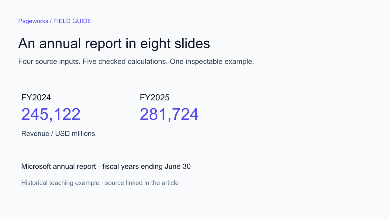
An annual report contains more information than a short presentation can carry. The first job is to choose a question. In this example, the question is narrow: how did revenue and operating margin change between two fiscal years? Four source values are enough to answer it without inventing a business explanation.
Start with four source values
The source is the Income Statements section of Microsoft’s FY2025 annual report. Both periods are fiscal years ending June 30. Amounts below are in millions of US dollars. Keeping that unit in the source table prevents a common error when shortening a report: silently switching between millions and billions.
| Metric | FY2024 | FY2025 |
|---|---|---|
| Revenue | 245,122 | 281,724 |
| Operating income | 109,433 | 128,528 |
Save the metric name, period, unit and source with each value. A number alone is not a reusable fact. If a reviewer asks where a percentage came from, the presentation should lead back to the inputs rather than another rounded sentence in the draft.
Calculate before asking for a narrative
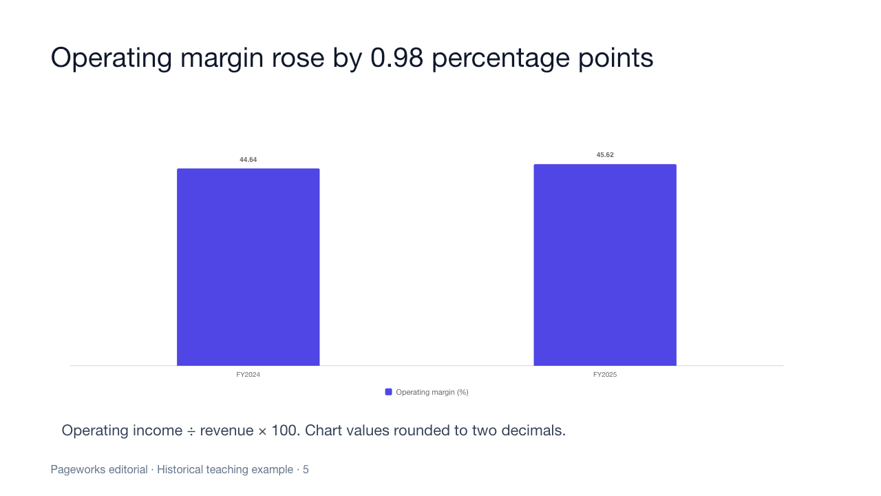
Revenue growth uses the earlier year as the denominator. Operating margin divides operating income by revenue within the same year. The change between two margins is expressed in percentage points. Those distinctions are easy to lose when a paragraph becomes a slide heading.
| Measure | Formula | Result |
|---|---|---|
| Revenue growth | (281724 / 245122 − 1) × 100 | 14.93% |
| Operating income growth | (128528 / 109433 − 1) × 100 | 17.45% |
| FY2024 operating margin | 109433 / 245122 × 100 | 44.64% |
| FY2025 operating margin | 128528 / 281724 × 100 | 45.62% |
| Change in operating margin | (128528/281724 − 109433/245122) × 100 | +0.98 percentage points |
Carry full precision through the calculation and round only the displayed answer. Writing “margin rose 0.98%” would describe a different calculation. Use “0.98 percentage points” when subtracting the two margin percentages. Do not use the number of slides, the document page count or the length of a summary as evidence of analytical accuracy.
Give each of the eight slides a specific job
Eight slides is an editorial choice for this small example, not an ideal length for every annual report. The sequence leaves room for the source, the calculations and the questions the numbers cannot answer. It avoids turning each paragraph of the original document into a separate slide.
| Slide | Purpose | What belongs on it |
|---|---|---|
| 1 | Frame the question | Company, historical periods and the limited scope of this example. |
| 2 | Make the inputs inspectable | The four values with a shared currency unit. |
| 3 | Show revenue growth | A two-period chart and its growth formula. |
| 4 | Compare operating income | The two values and the calculated growth rate. |
| 5 | Explain the margin change | Two margins and a change labelled in percentage points. |
| 6 | Check comparability | Fiscal period, scale and metric definitions. |
| 7 | Name unanswered questions | Possible lines of investigation, without invented answers. |
| 8 | Provide the source | Original report link and the terms of the teaching example. |
The seventh slide is deliberate. A change in a ratio does not, by itself, establish why it happened. If you want a slide about the causes, read and cite the relevant disclosures. Adding an attractive explanation without that step makes the presentation less reliable, even if every displayed number is correct.
Use a brief that limits what the model can infer
Attach or paste the fact sheet alongside that brief. Review the outline before generating the full deck. The prompt asks the model to expose its intended claims, which gives you an earlier place to catch an incorrect period or an unsupported conclusion. It is a review aid, not a guarantee against errors.
Download the worked example
The package includes a PowerPoint with native text and two native charts, plus a Markdown fact sheet containing the inputs, formulas and reusable brief. Chart workbooks contain literal data snapshots, not live links to Microsoft’s report. Updating a year label does not refresh the underlying figures.
Use the example to inspect the structure and practice changing the source values. For your own report, create a fresh fact sheet first. If you replace the chart values, also recalculate the growth statement and review the period labels. A chart and a headline can disagree even when both remain editable.
Check the result at three levels
- Source accuracy: every displayed input matches the report, including the unit and fiscal period.
- Calculation accuracy: the denominator and formula match the metric in the heading.
- Claim accuracy: explanations, forecasts and recommendations have their own supporting evidence.
Then inspect the file in the presentation application your recipient uses. Change a title, a data value and a note. Confirm that the intended objects can be edited and that the slide remains readable. File structure checks alone do not establish compatibility with every PowerPoint version or with Google Slides.
The example deliberately uses a small number of metrics. For a broader report, repeat the same discipline for each additional claim. A table of segment results needs its own definitions and periods; it should not inherit a company-level denominator just because the preceding slide used one.
Build your own version in Pageworks
Start Pageworks with your brief or source document, review the outline, then compare the generated presentation against the fact sheet. This eight-slide structure fits within Free’s ten-slide allowance. The example file above remains available without buying an add-on.
For larger assignments, Pro starts at $5.99 and supports up to 50 slides with no daily presentation limit. It includes Smart generation, uploads up to 100 MB, editable PowerPoint and high-quality PDF, with watermark-free exports and sharing. Free PPTX uses slide images; some Pro layouts still contain image-based elements, so review the final handoff.
Questions about annual-report presentations
Can I use annual figures in a quarterly review?
Only when clearly labelled as annual context. They do not become quarterly results by moving into a QBR template. For a quarter-specific comparison, obtain the matching quarterly figures and check whether the report presents standalone or cumulative periods.
Should every source number appear on a slide?
Choose numbers that answer the presentation’s question. Keep other relevant information in an appendix or source file. State the scope so a short deck is not mistaken for a complete summary of the report.
Does the sample prove AI preserves financial facts?
No. It is an author-created reference example. Measuring AI performance requires actual runs, a predefined set of expected facts and a record of both omissions and unsupported additions.
Build your next presentation with Pageworks
Editable PowerPoint with Pro — or start on Free today
Related articles

Feb 10, 2026 · 1 min read
QBR decks: what leadership is actually looking for

Jan 15, 2026 · 1 min read
Sales proposal decks that survive the forward chain

Dec 20, 2025 · 1 min read
Where AI decks actually help in a business week